Cover Story Newsletter
I conducted user research on the design and execution for The Economist's first subscriber-only email newsletter.
The story
Sometimes, our projects at The Economist arise from exploratory research or in response to user feedback. Other times, our projects arise from a business idea, or as a stakeholder proposition. The Cover Story newsletter falls into that second category. We had always heard from subscribers that many had a keen interest in learning about how The Economist works in the background– how we source stories, how we create our cartoons, and beyond.
So it wasn't unexpected when stakeholders in the retention team came to the newsletter squad with an idea about a newsletter on the making of our covers. The concept was straightforward– would subscribers be interested in learning about the story behind how we create and select our cover images?
The idea would be to make it a subscriber-only perk, in part to give our subscribers a reward for being valued customers, and to entice non-subscribers who might be interested in learning about this. So with this goal in mind, we got to work.
The problem
When we started this project, the process was very different than how we usually approached developing a digital solution– usually, we'd started with some sort of research, or feedback we received from customers. With Cover Story, we had to go backwards.
The design, retention, and editorial teams approached us with a fully fleshed-out concept, complete with exactly what they want to include and even a high-fidelity mockup of what the newsletter would look like. Not ideal from a UX point of view! However, we took it in stride and decided to conduct research to find out we could improve upon this idea. To do this, I developed a research plan to validate some of the hypotheses stakeholders had of this newsletter.
The first version of the newsletter (pictured below) was sent over by the graphics team– originally, the newsletter was meant to focus on the story behind the lead article of the week, from which the cover image is based on. We wanted to find out whether this resonated with subscribers.


The audience
From the beginning, this newsletter was targetted at Economist subscribers. Up until that point our newsletter portfolio was open to all registered readers of The Economist– that is anyone, with an account on the website could sign-up to our newsletters (with the exception of the Espresso newsletter).
Cover Story served as a way to experiment with new concepts, and was meant to answer the question: how would our subscribers feel if we gave them something they couldn't find anywhere else? Our hypothesis was that subscribers would enjoy this, and would place a higher value on their subscriptions. But we still needed to find out whether this was true.
The team & role
I was the lead UX designer on the newsletter team, working alongside a product and delivery manager, as well as a team of Salesforce Marketing Cloud developers. My role involved conducting user research around the Cover Story concept to help inform its design and development.
My role also involved defining and developing user discovery and sign-up journeys for Cover Story. This was our first newsletter in which we had to develop a way for only subscribers to be able to sign-up.
Activities included: Defining various use cases, creating user journeys, defining personas, conducting both unmoderated and moderated usability tests, as well as conducting one-on-one user interviews with current Economist subscribers.
Tools: Sketch, Figma, Miro, Validately, Google docs
The design process
For this project, I worked on two simultaneous activities. The newsletter production process at The Economist is much shorter than the build and release process for other digital products, such as apps and the website– thus I only had about two weeks to conduct all research and wireframing activities for both the newsletter mockup and sign-up process.
In that time, I also had to ensure the newsletter template and sign-up page was sent over to the graphics team to create the high-fidelity mockups before getting sent over to developers. Lots to do in a short amount of time. First, I started working on potential sign-up journeys– together with our front-end developer, we figured a simple solution for moderating sign-ups was to create a paywalled sign-up page. I developed user journeys for this concept.
.jpg)
Next, I started to wireframe ideas for what the paywall could look like, and what information it should include to serve these different use cases. Our primary target audience was subscribers– we estimated that about 90% of subscribers would be reached out to sign-up to Cover Story, a figure with arrived to along with the marketing team. Our secondary audience was registered users. In this case, we needed to give them the option to be able to purchase a subscription in order to sign-up.

.png)
Use case 2 - users who are not signed in to their account can see the full paywall. Subscribers can log in to sign-up or new users are prompted to purchase a subscription.
%20copy.png)
Use case 3 - registered users signed in to their accounts, with no subscription, get shown a truncated paywall that only gives them the option to view subscriptions. This is to prevent signed-in users to try to sign-in again.
Additionally, both paywall options gives users who don't fall in these use cases (edge cases) the option to contact customer service for help.
At the same time, I worked on developing a research plan to validate some of the hypotheses we had for this project. We defined these assumptions and hypothesis to try to test:
-
Hypothesis: Economist subscribers want a peek ‘behind the curtain’ to understand the ‘how’ and ‘why’ of our covers each week.
-
Hypothesis: The Cover Story newsletter is a strong enough value proposition to increase engagement among current Economist subscribers.
-
Assumptions
-
A newsletter is the best/most desirable format for subscribers to consume content on ‘Cover Story.'
-
The best makeup for this newsletter would include modular/regional sends to target different types of subscribers.
-
For the first test, I ran an unmoderated study with a small cohort of Economist subscribers recruited through Apptentive, intercepted on the mobile app. Subscribers could access the unmoderated study via a link to Validately. We tested with a mockup of the newsletter with dummy content on that week's cover.

Through this first study, we found that one specific aspect stood out to and resonated most with subscribers: the section on the making of the cover. I suggested to the team that we lead with this and that it should be the main focus of the newsletter, instead of a brief section at the end of the email.

Based on the feedback, we iterated on the original design and produced a second version of the newsletter that focused more heavily on the story behind the making of the cover and ran additional testing. For the second of testing, we ran unmoderated tests with 11 user testers and 6 moderated interviews with current Economist subscribers. For this test, we also showed user testers our Weekly newsletter which also heavily features the magazine's cover, to test whether they would tell the difference between both.


This time, our cohort of user testers was much more diverse and included both non-subscribers and subscribers. We wanted a variety of perspectives, including readers who have very little familiarity with the Economist all the way to very loyal Economist subscribers. We wanted to know– could this appeal to both types of readers?

In general, we uncovered that this version resonated much more with user testers and that there was a genuine interest in the idea for this newsletter. When compared to our Weekly newsletter, users could tell the difference between each, and all said that they found Cover Story to be much more valuable and unique. A few issues persisted, however. For one, subscribers frequently pointed out that they felt the newsletter was too text-heavy, and that they wished that we would focus more on the images of the making of the cover. Additionally, we received feedback that users felt like this wasn't exclusive content– nothing in the newsletter was indicating that this would be accessible only to subscribers.

Additionally, I put together interviewee profiles with quotes from my interviews with subscribers, to provide a more complete image for stakeholders and to build empathy. Each subscriber interview came from a different background and had diverse experiences with The Economist.


Finally, after analyzing the most salient insights, I put together a list of actionable recommendations for stakeholders to consider in an effort to improve the current template for Cover Story. I structured it as an insight point and an action point that accompanied each insight. Some of these included:
-
Subscribers understand the value proposition behind Cover Story, and how it’s different to Weekly. However, it is not visually different or unique. It does not make subscribers feel like they are getting access to something special, and it does not look different from our other newsletters.
-
Action point: Could we introduce some visual elements to our subscriber-only newsletters that signal to subscribers that this is exclusive/special content?
-
-
Subscribers were primarily interested in the visual aspects of this newsletter and felt it would be more valuable if it was something they could spend just a few minutes looking at, instead of having to read it. Many felt there was too much text.
-
Action point: Could this be a primarily image-based/visual newsletter?
-


Use case 1 - subscribers who are signed in to their accounts can automatically access the sign-up page.
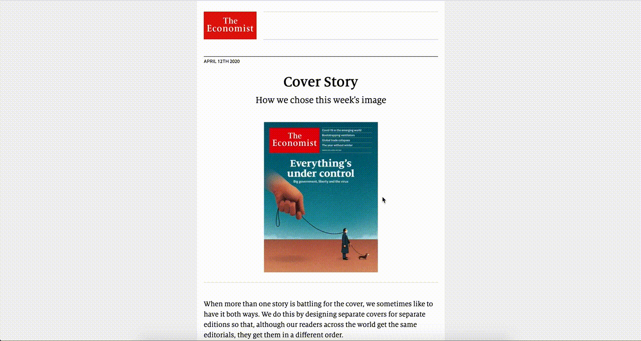
With these recommendations in mind, the graphics team iterated on the template and produced a third version of the newsletter. In this version, they focused primarily on the images of the making of the cover, including sketches, cartoons, and the scrapped cover ideas for that week. The also included a sign-post at the end of the newsletter that signals to subscribers that this is a subscriber-only newsletter with exclusive content. Finally, they altered the tag-line for the newsletter to better indicate to readers what the newsletter is about– from 'Explaining our highest-profile decision of the week' to 'How we chose this week's image' – to demonstrate an element of storytelling behind the newsletter.
The result
The Cover Story newsletter launched in mid-March 2020, right as many governments were implementing stay-at-home and shelter-in-place policies in response to the coronavirus epidemic. It was sent to an initial ~30,000 Economist subscribers.
The result
The Cover Story newsletter launched in mid-March 2020, right as many governments were implementing stay-at-home and shelter-in-place policies in response to the coronavirus epidemic. It was sent to an initial ~30,000 Economist subscribers.

Since launch, we have received an overwhelming amount of positive feedback from readers– the newsletter has continued growing month over month, with over 70,000 signed-up subscribers to date, open rates of over 50%, and click-through rates of over 10% each week, for a primarily image-based newsletter.
But more than anything, it has achieved at creating a feeling of community, intimacy, and understanding among our readers– it has made subscribers feel more connected to The Economist.
Feedback from our readers:
“It gives the feeling of being involved.”
“I'm an editor and went through the same process on a smaller scale for a business magazine I co-owned for 25 years. Wish I'd thought of this as part of our per issue newsletter as it's an intelligent and non-patronising device for creating community.”
“I always like to know why things are done the way they are. I also am fascinated by the thinking process--why this and not that.”
“There is so much to love about your newspaper and the cover is always high on the list (I often email it to my daughters so they can share my delight). Thanks very much for letting us see how creativity happens. Whoever came up with the idea for this newsletter deserves to take the rest of the day off!”
“Always interested in how these editorial decisions are made. The covers are often a thing of beauty."
“Fascinating and a bit moving.”
“Seeing the sketches of other ideas was very neat.”
“The pencil sketches and the description of winnowing down to the essentials of the message. More of the same please!”
“I felt spoken to and included. (I had a churning stomach at the image of an old lady behind bars. I am at that age and cringed at the power of the picture whilst sitting tight in my home).”
Learnings
This project was tough in unexpected ways. At first, I was unsure about the idea that it was a stakeholder-led, instead of a user-led initiative. It was challenging to champion user research and build a case as to why customer feedback was important– since stakeholders already had a very concrete vision in mind.
However, I learned that small, user-led iterations can have a significant impact on the direction of a project, and that showing the result of this work helps to bring along leadership as to why supporting user research is important.